

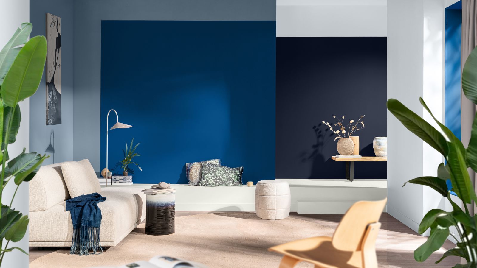
Choosing a new palette can feel like standing in front of a wall of paint chips with no map. Every year, the major Australian paint brands release their colour forecasts, and every year the language sounds a little different while the underlying mood tells a consistent story. For 2026, that story is one of warmth, texture and connection to the natural world — a shift away from stark, cool minimalism towards tones that feel lived-in and calm. Here is what those themes actually mean when it comes time to pick paint colours for a specific room.
What’s Trending in 2026 Colour Forecasts
Across this year’s forecasts, a few threads keep reappearing. Warm neutrals — think sandy beiges, soft clays and muted taupes — are taking over from the cooler greys that dominated the previous decade. Earthy, nature-inspired tones such as olive, terracotta and muted greens are showing up as accent choices, echoing native landscapes and a broader interest in bringing the outdoors in. There is also a clear appetite for depth: instead of flat, one-note walls, forecasts are leaning into layered combinations of a warm neutral base with a richer, more saturated feature tone. None of this means bold colour is out — it simply means bold colour is being used more deliberately, as an accent rather than an all-over statement.
The practical takeaway is that these forecasts are less about chasing a single trendy shade and more about a mood: grounded, warm and tactile. That mood translates differently depending on which room you are working with.
Living Rooms and Shared Spaces
Living areas are where the warm-neutral trend earns its keep. A soft, warm off-white or a gentle greige on the main walls creates a flexible backdrop that works with existing furniture, timber flooring and changing light through the day. If the space feels like it needs more personality, a single feature wall in an earthy tone — a muted olive, a warm terracotta or a deep clay — adds interest without overwhelming a room people spend hours in. Because living rooms tend to have the most natural light variation across a day, it is worth remembering that warm tones can shift noticeably from a crisp midday glow to a much cosier look under evening lamplight.
Kitchens and Dining Areas
Kitchens are following the same warm trajectory, particularly on cabinetry and joinery rather than just walls. Soft sage and olive greens continue to sit comfortably alongside warm timber tones and natural stone benchtops, while dining areas benefit from slightly richer, more saturated wall colours that suit evening entertaining. For interior painting in kitchens specifically, practicality still matters as much as colour choice — a durable, washable finish matters more here than almost anywhere else in the house, so the conversation with a painter broadbeach should always cover finish and sheen level alongside the shade itself.
Bedrooms
Bedrooms are the room where the “calm and grounded” theme is most literal. Muted, dusty versions of blue, green and clay are popular choices for a restful feel, generally in a matt or low-sheen finish that softens light reflection. Deeper, moodier tones are increasingly common on a single wall behind the bed, paired with lighter warm neutrals on the remaining walls and ceiling to avoid the room feeling closed in. For anyone renovating a main bedroom with resale in mind, warm neutrals remain the safer long-term choice, with a richer accent colour reserved for soft furnishings that are easier to change later.
Bathrooms
Bathrooms have historically leaned towards crisp whites and cool blues, but the 2026 forecasts suggest a softer, warmer palette here too — think warm greiges, soft clay pinks and gentle greens that pair well with natural stone-look tiles. Ventilation and moisture-appropriate paint remain non-negotiable regardless of colour choice, so it is worth confirming that any chosen shade is available in a bathroom-suitable, mould-resistant formulation before committing.
Exteriors and Facades
For house painting on the exterior, the warm-neutral movement is showing up in render and weatherboard colours that sit closer to sand, stone and soft clay than the cooler whites and greys of recent years. These tones tend to complement Australian light and established gardens particularly well, and they pair naturally with darker, warmer trims on window frames, gutters and front doors rather than the high-contrast black-and-white combinations that have been popular. As with any exterior work, colour should always be considered alongside surface preparation, since a beautiful shade will not compensate for a substrate that has not been properly prepared.
Test Before You Commit
Whatever direction a colour forecast points, the single most useful piece of advice remains unchanged: test before you paint the whole room. Paint colours can look dramatically different depending on natural light, artificial lighting, aspect and the colours of surrounding furniture and flooring. A shade that looks warm and inviting on a small chip can read as flat or even slightly off once it covers four walls.
The most reliable approach is to paint sample patches — ideally at least A3-sized — on two or three different walls in the room, including one that gets direct sunlight and one that does not. Live with the samples for several days, checking them in the morning, at midday and again at night under artificial light, before making a final decision. Many paint brands also offer digital colour-matching tools and small sample pots specifically for this purpose, which is a far cheaper way to avoid disappointment than repainting an entire room.
Getting the Finish Right
Colour choice is only half the equation — the quality of preparation and application has just as much impact on how a finished room actually looks and how long it lasts. Experienced painting and decorating contractors, such as MDC Specialists on the Gold Coast, can be a useful resource when translating a forecast colour into the right finish, sheen level and application for a specific surface, whether that is a feature wall, full interior repaint or an exterior facade.
Ultimately, the 2026 forecasts point towards warmth, texture and a closer connection to the natural environment, but the best palette for any given home is still the one that suits its light, its layout and the people living in it. Use the trend as a starting point, test thoroughly, and let the space itself have the final say.
